Revamped LinkedIn presence to enhance talent acquisition.
Crafting visually engaging job post layouts aimed to improve candidate perception of the company & stand out in a photo crowded feed.
What she did
the 8 most impactful skills
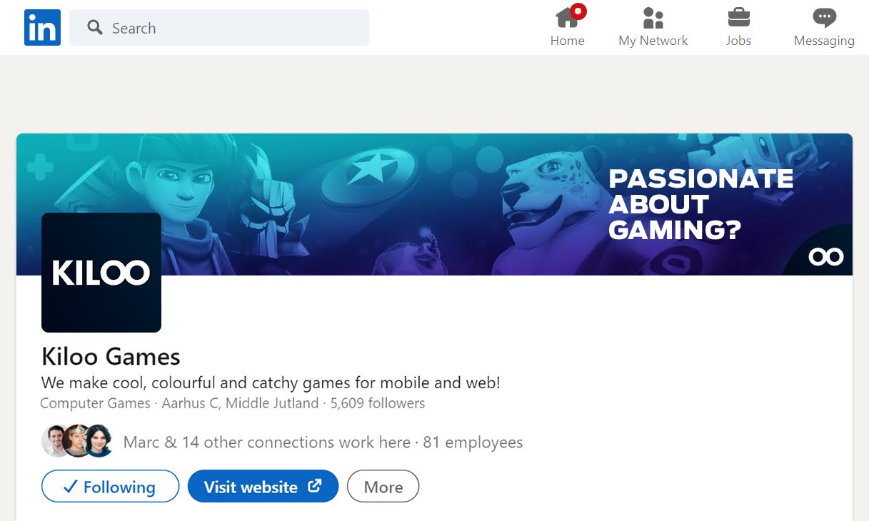
Developed a recognizable visual brand identity for LinkedIn. Continuously improving and refining it based on incoming data, ensuring a cohesive and truthful brand perception.
Generated original and engaging mindmaps using tools like Miro, to effectively visualize and communicate, ideas, strategies and concepts to stakeholders.
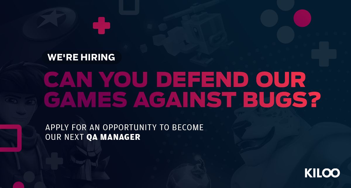
Crafted visually engaging job post layouts aimed to improve candidate perception of the company & stand out in a photo crowded feed.
Developed, produced, and managed engaging social media content (posts, visuals, captions) that resonated with potential candidates.
Created a design that were easy to update and reuse, building a system of templates and elements to quickly create new versions and efficiently meet changing needs.
Created visually balanced compositions that felt clam and readable. To ensure the most important elements were noticed first and in the intended order.
Built design templates, color palettes, typography overviews, and documented instructions throughly within a design guideline document.
Documented workflow processes, asset specifications, and technical details for future reference and team collaboration.
choosing direction
She conducted a deep dive into the social media landscape of leading gaming companies to understand what resonates most with audiences.
This extensive research, combined with the established Kiloo Games aesthetic, led to a clear vision for the brand identity update.
Previous
Next
"A Bold, Cohesive Look"
The new visual direction, featuring a striking dark theme with blue accents and signature Kiloo Games characters, seamlessly aligns with the recently revamped website. This ensures a consistent brand experience across all touchpoints.
“… This creates a visually rich experience while maintaining clear hierarchy and readability, …”
"Designed with Purpose"
Each visual element, including the strategic use of gradients for job postings, serves a specific purpose. This creates a visually rich experience while maintaining clear hierarchy and readability, ensuring the most important information stands out.
"Built for Engagement "
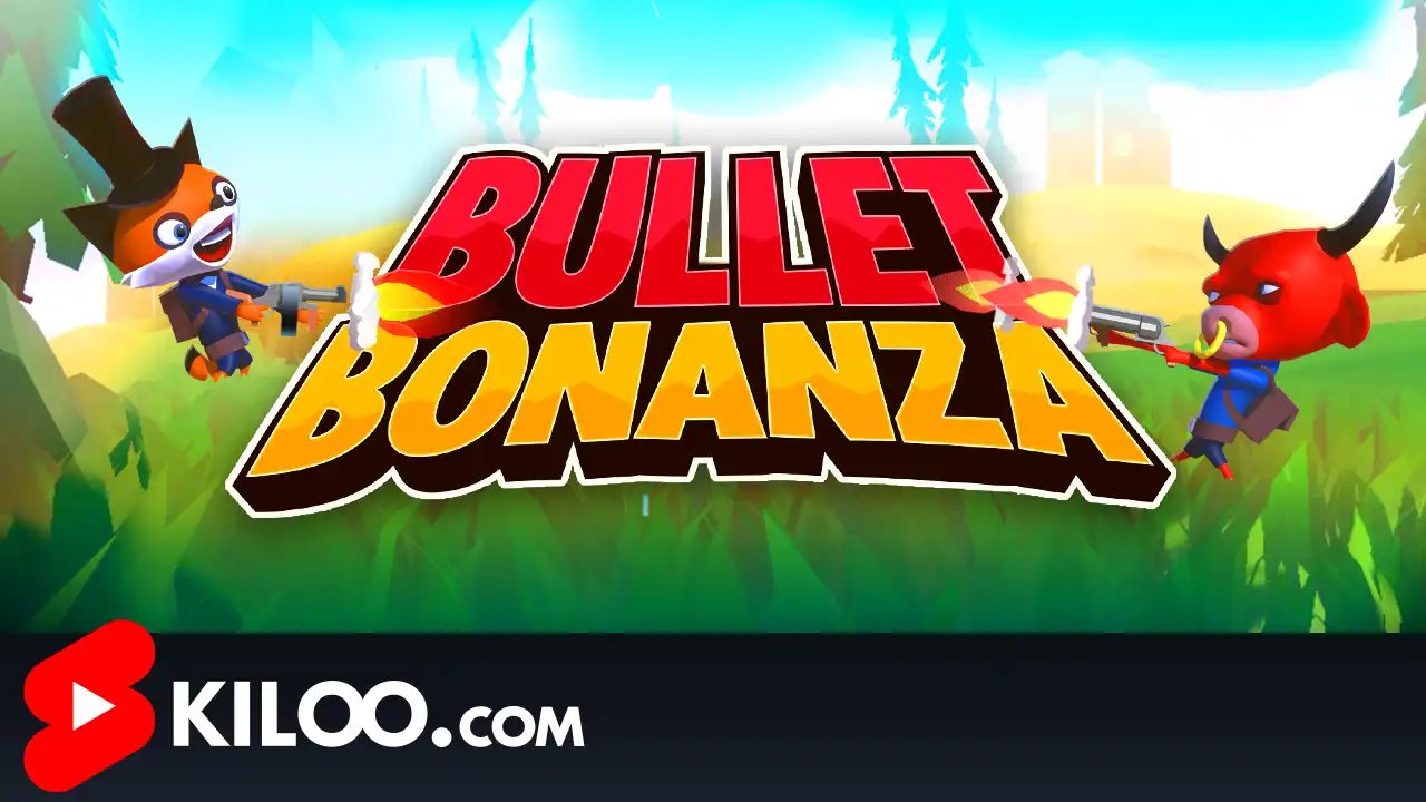
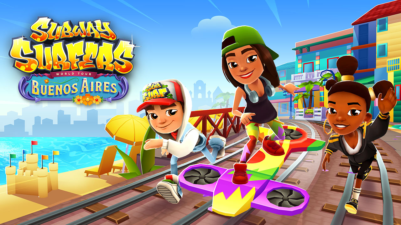
By incorporating "game-like" elements and leveraging the popularity of our beloved characters, we're fostering deeper connections with our audience. This playful yet sophisticated approach has proven to capture attention and drive engagement in the past.
"Ready to level-up"
Beyond the initial impression, the plan was to stay focused on continuous improvement. By utilizing data analytics to track engagement and optimize the approach further, ensuring our social media presence remained impactful and reflected the dynamic gaming community we served.